The panel allows you to apply formatting to text in several ways:
as character formatting to individual letters, words, sentences and paragraphs as well as entire stories.
as paragraph formatting to one or more paragraphs as well as entire stories.
as text styles (including character styles, paragraph styles and group styles).
The Text panel, with the following sections: Text Styles (A), Character (B), Justification and Flow—including Hyphenation (C), Bullets and Numbering (D), Indents and Tab Stops (E), Spacing (F), Drop Caps (G), Baseline Grid (H), Text Frame (I), Glyph Browser (J), Decorations (K)
Using the panel
Tap the pin icon in the top right of the panel to hide the panel automatically when you are no longer focusing on it.
Each section of the panel's top level shows its most commonly used options. Tap the arrow at the right of a section to expand it, which reveals additional options.
When viewing a section or subsection, tap the arrow at the top left of the panel to return to the top level/parent section, respectively.
Text Styles
The Text Styles section gives you access to all the text styles in your document, allowing you to apply them, modify them, delete them or create new ones.
The section shows you which styles are applied to the current selection and gives you the option to apply paragraph and character styles at the caret position or to selected text.
You also have the option to create new paragraph and character styles, redefining existing styles, or deleting them. You can also set specific text styles as defaults and for importing text styles from other projects.
Options
The following options are available directly on the panel:
Text Style—allows a paragraph text style to be applied to selected text.
Update Paragraph Style—redefines the current paragraph style to conform with the local formatting of the selected text. (Shown only when local formatting has been applied in addition to the selected text style.)
The following options are available in the expanded Text Styles section:
Text style name—displays the name of text styles currently available in the document.
Options menu—shown at the right end of a text style's entry and provides access to a pop-up menu with creation and editing options.
The following options are available from Panel Preferences:
Show Local Formatting—when selected, a local formatting box is displayed to show the text formatting directly applied to the currently selected character, word or paragraph (or the text under the text cursor). Paragraph and character styles are also shown if applied.
Show Hierarchical—styles appear nested below styles which they are based on
Show Samples—when turned on, each style name on the panel mirrors the corresponding style's settings. When turned off, all styles' names show with the same formatting.
Sort By Type—when selected (default), paragraph styles are listed first, followed by character styles. If this option is off, styles are listed purely in alphabetical order.
Delete Unused Styles—when selected, deletes any unused styles and removes them from the panel.
Detach and Delete All Styles—when selected, deletes all styles and removes them from the panel.
Save Styles as Default—when selected, saves styles as default styles.
Import Styles—when selected, opens a pop-up dialog allowing you to select styles to import from another Affinity document.
Character
Apply local formatting to individual letters, words, sentences and paragraphs as well as entire stories.
Options
The following settings are available directly on the panel:
Font Family—sets the typeface for the selected text. Select from the pop-up menu.
Font Color—sets the color of the text. Select from the pop-up panel.
Font Size—controls the point size of characters.
Traits—certain fonts come with a selection of traits you can choose from.
Bold—select whether the text is emboldened.
Italic—select whether the text is italicized.
Underline—select whether the text has no underline or a single underline.
Strikethrough—select whether the text has no strikethrough or a single strikethrough.
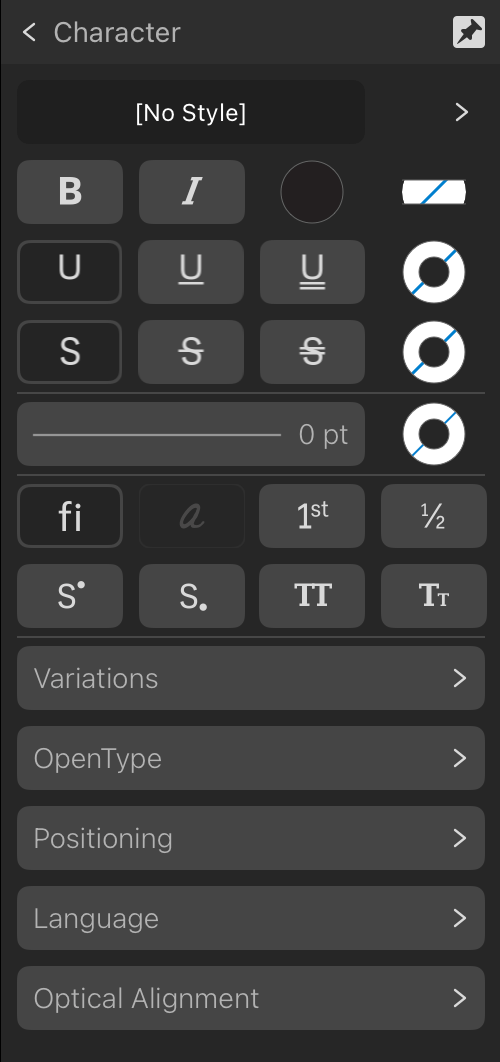
The following options are available in the expanded Character section:
Text Style—allows a character text style to be applied to selected text.
Update Character Style—redefines the current character style to conform with the local formatting of the selected text. (Shown only when local formatting has been applied in addition to the selected text style.)
Font Family—sets the typeface for the selected text. Select from the pop-up menu.
Traits—controls which typeface style is applied to the selected text (as supported from the font).
Bold—select whether the text is emboldened.
Italic—select whether the text is italicized.
Font Color—sets the color of the text. Select from the pop-up panel.
Background Color—sets the color applied behind the selected text (i.e., creating a highlight effect). Select from the pop-up panel.
Underline—select whether the text has no underline or a single or double underline.
Underline Color—sets the color of the text underline. If this is set to 'None', the underline color will match the Font's color. Select from the pop-up panel.
Strikethrough—select whether the text has no strikethrough or a single or double strikethrough.
Strikethrough Color—sets the color of the text strikethrough. If this is set to 'None', the strikethrough color will match the Font's color. Select from the pop-up panel.
Outline Stroke—sets the outline stroke style and width, along with stroke cap, join and alignment.
Outline Color—sets the color of the outline stroke. If this is set to 'None', the outline color will match the Font's color. Select from the pop-up panel.
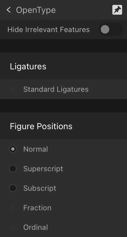
Standard Ligatures—applies any available typeface ligatures to the selected text.
Contextual Alternatives—applies any alternative typeface designs available for glyphs depending on their relative position within a word or with respect to neighboring glyphs.
Ordinals—automatically applies a superscript to letters which are part of an ordinal number.
Fractions—dynamically converts fractions into a single glyph.
Superscript—converts text characters to superscript, i.e. characters are set higher than neighboring characters and font size is decreased.
Subscript—converts text characters to subscript, i.e. characters are set lower than neighboring characters and font size is decreased.
All Caps—displays all selected text as upper case (or small caps, if Small Caps option selected).
Small Caps—displays lower case letters as miniature upper case.
The following subsections are also available in the expanded Character section:
Variations
When a variable font is applied to the selected text, allows you to change settings for each of the font's adjustable axes.
Available axes differ by font.
OpenType
Allows you to enable or disable OpenType font features where applicable. Apply a font to your text that supports OpenType features in order to use this.
The following additional settings are available in the expanded subsection:
Hide Irrelevant Features—hides OpenType settings from the expanded section that are not available in the applied font.
Positioning
The following settings are available in the expanded subsection:
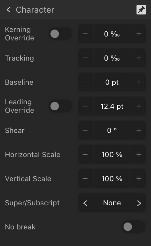
Kerning Override—controls the kerning (distance) between characters.
Tracking—controls the spacing between characters.
Baseline—controls the position of the bottom of text characters. Positive values raise the baseline, negative values lower the baseline.
Leading Override—applies a local override to selected text to increase the leading with regard to the paragraph’s leading.
Shear—controls the extent of text slant. Positive values will tilt text to the left, negative values will tilt text to the right.
Horizontal Scale—horizontal scale stretches the characters and spacing width with regard to point size.
Vertical Scale—vertical scale stretches the characters with regard to point size.
Super/Subscript—converts text characters to superscript or subscript, i.e. characters are set higher or lower than neighboring characters, respectively, and font size is decreased.
No break—enable to ensure lines will not be broken at the ends. Soft hyphens will still be honored.
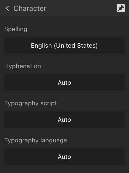
Language
Choose the language whose conventions you would like your text to follow for each available pop-up menu.
The expanded subsection allows you to specify separate languages for:
Spelling—specifies the language dictionary to be used for spelling. This will be the default used by the other language options if they are unmodified (set to Auto). It also determines which user-defined filler text, if entered in Settings, is displayed in the selected text frame.
Hyphenation language—specifies the language dictionary to be used for hyphenation. This can be used if a specific hyphenation dictionary is not available for the spelling language, but a suitable substitute is available. For example, it is possible to use English (Australia) spelling with English (United Kingdom) hyphenation.
Typography script—specifies the language script to be used when applying OpenType rules. For example, the Ordinals OpenType feature ‘ordn’ applies mainly to Latin script, and the Petite Caps feature ‘pcap’ only applies for scripts with both upper- and lowercase forms (e.g. Latin, Cyrillic, Greek). The list of available scripts will depend on the current typeface.
Typography language—specifies the language to be used when applying OpenType rules. For example, several OpenType features should only be applied to Japanese or Chinese text.
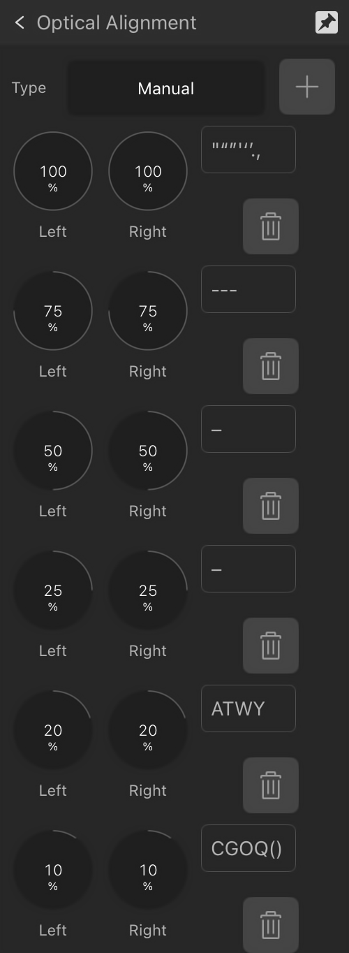
Optical Alignment
Optical Alignment determines how certain characters in your document (for example, punctuation marks or particular letters) will fit in relation to the text frame; this can be used to automatically extend lines beginning or ending with certain characters when text frames are snapped to page margin. Adjust the settings to ensure the characters you choose are aligned to your liking.
The following options are available in the expanded subsection:
Justification and Flow
Control the position and flow (including hyphenation) of individual paragraphs or entire stories.
Options
The following settings are available directly on the panel:
Left Align—sets the paragraph alignment to adhere to the left edge of the text container.
Center Align—sets the paragraph alignment to be equidistant between the left and right edges of the text container.
Right Align—sets the paragraph alignment to adhere to the right edge of the text container.
Justified Left—sets the paragraph alignment to both the left and right margins. The last line of a paragraph is left aligned.
The following additional settings are available in the expanded Justification and Flow section:
Align Towards Spine—aligns the paragraph dynamically towards the left or right of the spine depending on relative positioning of the text frame in relation to the spine (no justification used).
Align Away From Spine—aligns the paragraph dynamically away from the left or right of the spine depending on relative positioning of the text frame in relation to the spine (no justification used).
Justified Center—as with Justified Left, however, the last line of a paragraph is center aligned.
Justified Right—as with Justified Left, however, the last line of a paragraph is right aligned.
Justified All—as with Justified Left, however, the last line of a paragraph is justified regardless of length (sometimes known as Force-Justified).
Start—determines where a paragraph should begin. Select from the pop-up menu:
Anywhere—fits the paragraph using default settings.
In Next Column—fits the paragraph in the next column.
In Next Frame—fits the paragraph in the next frame.
On Next Page—fits the paragraph on the next page.
On Next Odd Page—fits the paragraph on the next odd page.
On Next Even Page—fits the paragraph on the next even page.
Keep with previous paragraph—ensures the paragraph is kept with the previous paragraph on the page or column.
Prevent orphaned first lines—ensures the first line of the paragraph is not separated from the rest of the paragraph at the bottom of a page or column.
Keep paragraph together—ensures that the paragraph is not split apart.
Prevent widowed last lines—ensures the last line of the paragraph is not separated from the rest of the paragraph at the top of a page or column.
Keep with next—allows you to specify the number of lines of the next paragraph that must be kept with the last line of the current paragraph.
The following subsections are also available in the expanded Justification and Flow section:
Hyphenation
The following additional settings can be adjusted in the expanded Hyphenation subsection:
Use auto-hyphenation—enable to allow automatic hyphenation options to be used.
Minimum score—specify the minimum possible hyphenation score. Setting this score to a higher number will result in fewer words being automatically hyphenated.
Minimum word length—specify the minimum number of characters for hyphenated words.
Minimum prefix—specify the minimum number of characters to be used for a prefix to be hyphenated.
Minimum suffix—specify the minimum number of characters to be used for a suffix to be hyphenated.
Max consecutive hyphens—specify the maximum number of consecutive hyphens.
Hyphenation zone—specify the amount of space allowed before hyphenation begins.
Capital zone—specify the amount of space allowed before hyphenation begins where words are in all capitals.
Paragraph end zone—specify the amount of space allowed at the end of a paragraph before hyphenation begins.
Column end zone—specify the amount of space allowed at the end of a column before hyphenation begins.
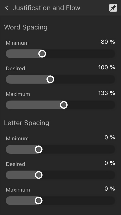
Justification Options
The following additional settings can be adjusted in the expanded Justification Options subsection:
Word Spacing—sets the minimum, desired or maximum gap allowed.
Letter Spacing—sets the minimum, desired or maximum tracking allowed. Desired tracking is applicable when a paragraph has a justified alignment.
Bullets and Numbering
Turn a series of paragraphs into bulleted, numbered or multi-level lists.
Options
The following options are available directly on the panel:
Bullet List—inserts a bulleted list.
—inserts a numbered list based on decimal numbers.
Roman List—inserts a numbered list based on small Roman numerals.
Latin List—inserts a numbered list based on Latin alphabetic characters.
The following options are available in the expanded Bullets and Numbering section:
Type—select a type of Bullet or a choice of numbering list styles from the pop-up menu.
Level—enter a list level.
Text—allows you to adjust the symbol(s) you wish to use for your list, as well as the spacing between the symbols and the text. Tap to edit using your in-built or Smart keyboard or tap the More (…) button to browse additional symbols via a glyph browser.
Tab stop—adjust the distance text moves by in your list when the tab key is pressed.
Alignment—select from Left Align Bullet/Number, Center Align Bullet/Number, or Right Align Bullet/Number. For the latter two options, First Line Indent must be greater than 0.
Start numbering at—for numbered lists, you can adjust the number the list starts from.
Restart numbering—for numbered lists, you can restart the numbering at certain points within the list.
Restart numbering now—enable to immediately restart the numbering from the current point within your list.
Name—name your list.
Global—enable this option to make this list available to be used multiple times within your design.
Style—select a character style from the pop-up menu.
Indents and Tab Stops
Aligns text inward from the left and right sides of its text frame.
Options
The following options are available directly on the panel:
Decrease Indent—decreases the amount of indent at the start of text.
Increase Indent—increases the amount of indent at the start of text.
The following additional settings can be adjusted in the expanded Indents and Tab Stops section:
Indents
Left Indent—controls the left indent applied to the entire paragraph (excluding the first line).
Right Indent—controls the right indent applied to the entire paragraph.
First Line Indent—controls the indent applied to the first line of the paragraph.
Last Line Outdent—controls the outdent applied to the last line of the paragraph.
Tab Stops
Default Spacing—sets the default horizontal space added before a character when a tab () is inserted.
Add Tab Stop—adds a new tab stop position using the currently set Default Spacing value. The new tab stop entry will appear in the box; you can override the default position by using the minus and plus buttons.
Delete selected tab stop—shown on a tab stop entry, this removes a chosen tab stop.
Tab Stop Advance—shown on a tab stop entry, expand to set advanced settings:
Align—sets the alignment of the selected tab stop to left, center, right or decimal.
Leader—sets the characters (none, character, underline and strikeout) displayed before the selected tab stop.
Decimal—sets the decimal point character to align to when Tab stop alignment decimal is selected.
Character—sets the character to be used when Tab stop leader character is selected.
From right—defines tab stop measurement from the right edge of the column, rather than the left.
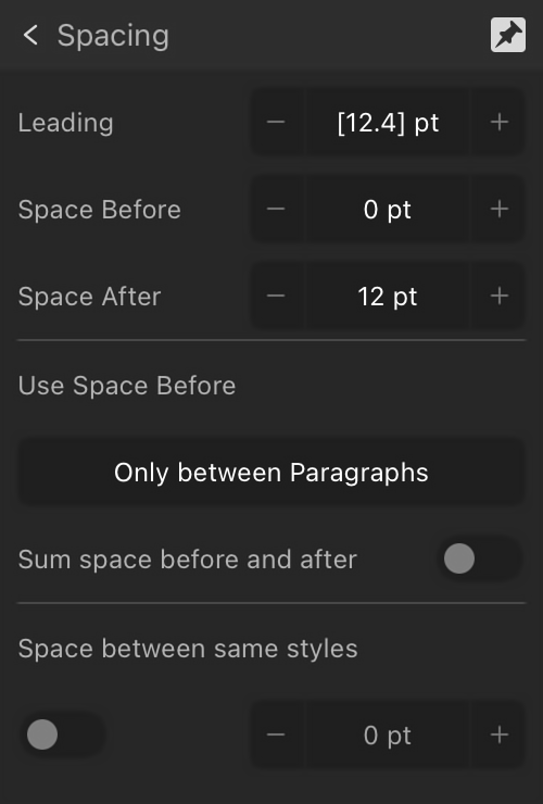
Spacing
Control the distance between text baselines and paragraphs.
Options
The following option is available directly on the panel:
Leading—controls the distance between text baselines (vertical gap between lines) within the paragraph. Tap to select from the pop-up menu. Options include:
Default—sets the line spacing to the font's default (i.e., single).
Exactly—sets a fixed spacing (other text attributes are ignored for line spacing purposes). This can be adjusted using the presets in the pop-up menu.
% Height—sets spacing based on a percentage of the text's size. This can be adjusted using the presets in the pop-up menu.
At Least—sets a minimum spacing (actual line spacing may increase depending on other text attributes). This can be adjusted using the presets in the pop-up menu.
Multiple—controls line spacing as a portion of the default. This can be adjusted using the presets in the pop-up menu.
The following additional settings can be adjusted in the expanded Spacing section:
Space Before—controls the vertical gap which precedes the paragraph. By default, this is not applied at the top of a column; this can be altered from the Use space before: pop-up menu.
Space After—controls the vertical gap which succeeds the paragraph.
Use space before—controls when Space Before paragraph settings are applied to the text. Select from the pop-up menu.
Sum space before and after—when this is enabled, the sum of the Space Before and the Space After settings are used to determine spacing between paragraphs.
Space between same styles—when this is enabled, you can manually set the spacing between paragraphs of the same style. Enter the value using the adjacent Space Between Paragraphs option.
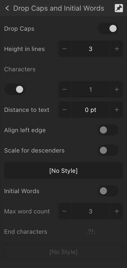
Drop Caps and Initial Words
Enlarges characters at the start of paragraphs so they span multiple lines of text.
Options
The following option is available directly on the panel:
Drop Caps—enable this option to switch on drop caps.
The following additional options are available in the expanded Drop Caps and Initial Words section:
Height in lines—specify the height of the dropped capital in lines.
Characters—when the switch is turned off, specify the number of characters to be formatted as drop caps, regardless of their types. When the switch is turned on, the drop cap encompasses the first alphanumeric character and any preceding punctuation.
Auto—turn on to include the first alphanumeric character and any preceding punctuation in the drop cap. When turned off, the value of the Characters setting is used, regardless of character types.
Distance to text—specify how close the dropped capital and the rest of the text should be. This value can be negative to allow the text to be closer to the dropped capital.
Align left edge—enable to ensure the dropped capital is aligned to the left-hand edge of the column.
Scale for descenders—enable to ensure that the size of any dropped capital containing descenders is automatically adjusted so it matches the alignment of other dropped capitals.
Style—select a style from the pop-up menu or tap New to create a new style using the pop-up menu.
Initial Words—enable for initial word formatting to be used.
Max word count—specify the maximum number of words to which initial word formatting should be applied.
End characters—specify which characters can be used to automatically end the initial word formatting.
Style—select a character style from the pop-up menu.
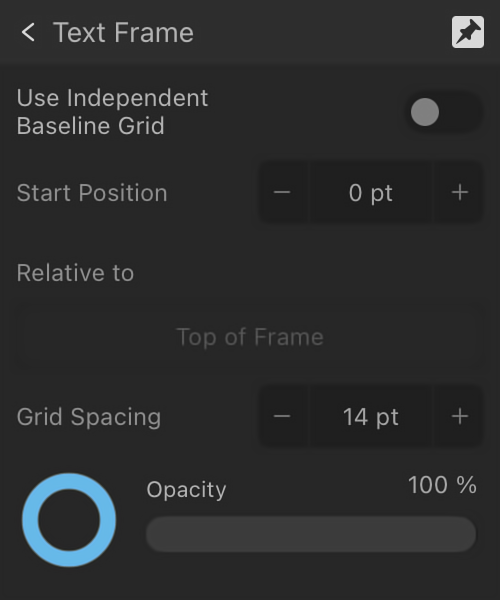
Baseline Grid
Specify whether the selected text has the document-wide baseline grid or, if enabled in the expanded Baseline Grid section, its own, independent baseline grid settings applied.
Options
The following option is available directly on the panel:
Baseline Grid—enable to apply the document-wide baseline grid or, if configured in the panel's expanded Baseline Grid section, an independent baseline grid to the current text frame.
The following options are available in the expanded Baseline Grid section:
Use Independent Baseline Grid—enable to apply a baseline grid to the current text frame. Any document-wide baseline grid is then overridden by this section's settings.
Start Position—specify the offset of the first grid line from the origin at Relative to.
Relative To—specify what the baseline grid's starting position is in relation to.
Grid Spacing—specify how far apart consecutive horizontal grid lines are.
Color—tap the swatch to display a pop-up panel to set the line color. Swipe the Opacity slider to set the opacity of the line color.
Text Frame
The Text Frame heading encompasses several expandable sections of the panel:
Text Frame—adjust the frame appearance, including frame stroke/fill color, insets, and baseline grid control.
Columns—adjust the number of columns of text in the frame, column and gutter widths, whether column rules are shown, and associated settings.
Vertical Alignment—adjust the vertical alignment and spacing of paragraphs in the frame.
Options
The following settings are available directly on the panel:
Fill—tap the color swatch to display a pop-up panel to update the text frame's fill color.
Stroke—tap the color swatch to display a pop-up panel to update the text frame's stroke color.
Stroke Properties—tap to display a pop-up dialog allowing you to apply a stroke style, width, dash patterns, pressure setting, drawing order and scaling options to the text frame.
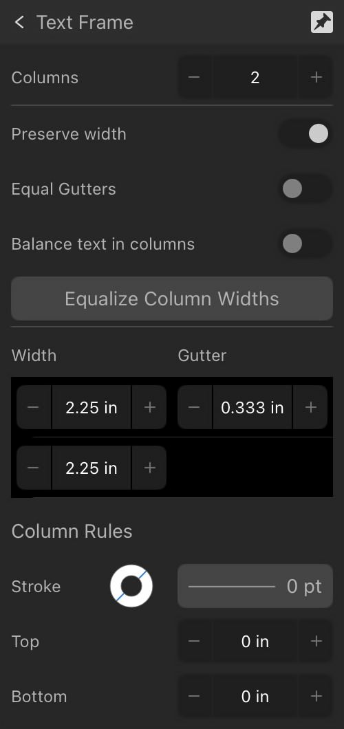
Columns—specify the number of columns in your text frame.
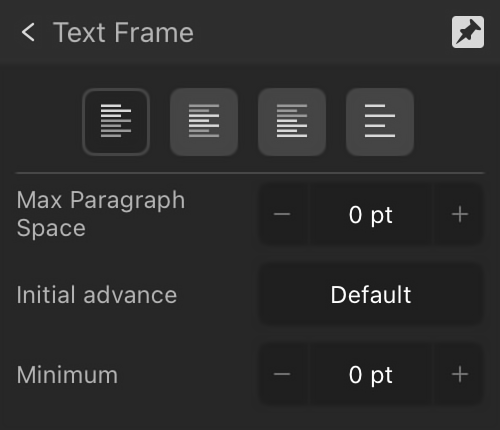
Vertical Position—specify the vertical alignment of the frame text to one of the following:
Top Align—sets the frame text alignment to adhere to the top margin.
Center Align—sets the frame text alignment to be equidistant from the top and bottom margins.
Bottom Align—sets the frame text alignment to adhere to the bottom margin.
Justify—sets the frame text alignment to both the top and bottom margins.
The following additional settings can be adjusted in the expanded Text Frame section:
Fill—tap the color swatch to display a pop-up panel to update the text frame's fill color.
Stroke—tap the color swatch to display a pop-up panel to update the text frame's stroke color.
Stroke Properties—tap to display a pop-up dialog allowing you to apply a stroke style, width, dash patterns, pressure setting, drawing order and scaling options to the text frame.
Ignore Baseline Grid—enable to make the text frame ignore any currently set document-wide baseline grid.
Ignore Text Wraps—enable to stop frame text from wrapping around objects with text wrapping set.
Hide Overflow—enable to clip overflowing text that does not fit in the frame.
Lock—when unlocked, you can adjust Left, Right, Top and Bottom inset values independently of each other. When locked, adjusting any inset value sets the others to the same value.
The following additional settings can be adjusted in the expanded Columns section:
Preserve Width—when enabled, as column or gutter widths are changed, adjacent column sizes are automatically adjusted to match them. Adjusting the rightmost column will still change the frame size.
Equal Gutters—when enabled, the gutter widths are adjusted in proportion to each other. When disabled, they can be adjusted independently.
Balance text in columns—tick this checkbox to automatically balance columns of text regardless of size.
Equalize Column Widths—tap to automatically make all columns the same width, calculated from the text frame width minus any inset settings.
Column list—contains entries for each of the text frame's Columns, each with these settings:
Width—specify the width of each column, presented in column number order in the panel.
Gutter—specify the gutter size between each column.
Column Rules
Stroke—tap the color swatch to display a pop-up panel to apply the rule stroke color.
Stroke Properties—tap to display a pop-up dialog allowing you to apply a stroke style, width, dash patterns, pressure setting, drawing order and scaling options to the column rule.
Top—specify the amount of vertical space between the top of the text frame and the column rule.
Bottom—specify the amount of vertical space between the bottom of the text frame and the column rule.
The following text frame settings can be adjusted in the expanded Vertical Position section:
Max Paragraph Space—specifies the maximum spacing between justified baselines in the text frame. Alignment must be set to Justify.
Initial Advance—sets the vertical spacing between the top of the text frame and the first text line's baseline; the distance can be the currently set Leading, a Fixed value, the font's Point size or other typographic values. Use for consistent spacing on bordered text frames, text frames on colored backgrounds or for fine vertical alignment with other page elements.
Minimum—sets a minimum threshold value for initial advance. The value is global, i.e. not tied to any specific Initial Advance setting.
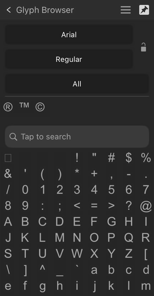
Glyph Browser
In typography, glyphs are graphical representations of a character within a typeface, such as Cyrillic or Latin. The Glyph Browser lets you insert glyphs into your text.
Options
The following options are available in the expanded Glyph Browser section:
Font Family—sets the typeface for the selected text. Select from the pop-up menu (all valid installed fonts are listed).
Traits—sets the font style, e.g., Bold.
Lock Font and Traits—when unlocked, the font shown in the panel changes with the selected text's font, making it easier to find glyphs from the currently selected font. When locked, the font shown in the panel doesn’t change with text selection. This makes it easier to repeatedly use glyphs from a particular font.
Subset—sets the chosen font subset to display glyphs from, e.g. Basic Latin, Arabic, Greek Extended.
Search—enter a Glyph value, a Unicode value or a text phrase to locate a Glyph or Unicode character. For example, "G+0131", "U+00b0" or the phrase "degree" will all show the degree symbol, respectively.
The following options are available from Panel Preferences:
Size—choose a display size for the glyphs; this benefits usability of the panel and does not affect the glyph output size.
Glyphs/Unicode/Unicode Plus Alternates—orders items in the panel, displaying the chosen option's items first.
Clear Recently Used—glyphs you use are added to the bottom of the panel for re-use. This option clears that list.
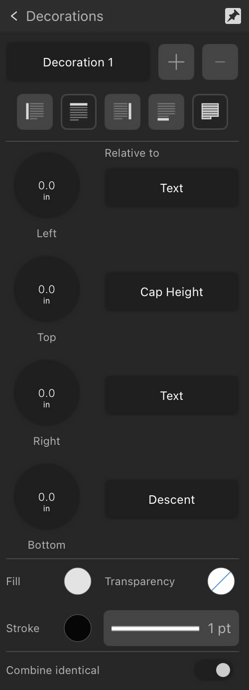
Decorations
Paragraph decorations, created around your text styles, can be used to differentiate blocks of text using decorative styles that will always move relative to the text.
Options
The following options are available in the expanded Decorations section:
Decoration—select a decoration to apply to the selected paragraph. Use the plus and minus buttons to create a new decoration or delete an existing decoration.
Position—specify where you would like the decoration to appear in relation to the selected paragraph. Select from Left, Top, Right, Bottom or Fill (additional options will become available in the panel when one of these is selected).
Left/Top/Right/Bottom—adjusts the indent settings of the decoration to your liking. A positive value will move the decoration closer to the text, whereas a negative value will move a decoration further away from the text.
Relative to—sets how the decoration is positioned, i.e. relative to a page element (Text, Column, Indent) or text element (baseline, x-height).
Fill—tap the color swatch to display a pop-up panel to update fill color.
Transparency—tap the swatch to display a pop-up panel. See the Gradient editing topic for more information on the settings available.
Stroke—tap the color swatch to display a pop-up panel to update stroke color.
Stroke properties—set the stroke style, width, joins, cap ends, order and arrowhead settings via a pop-up panel.
Combine identical—enable this option to automatically combine identical decorations.
 Text panel
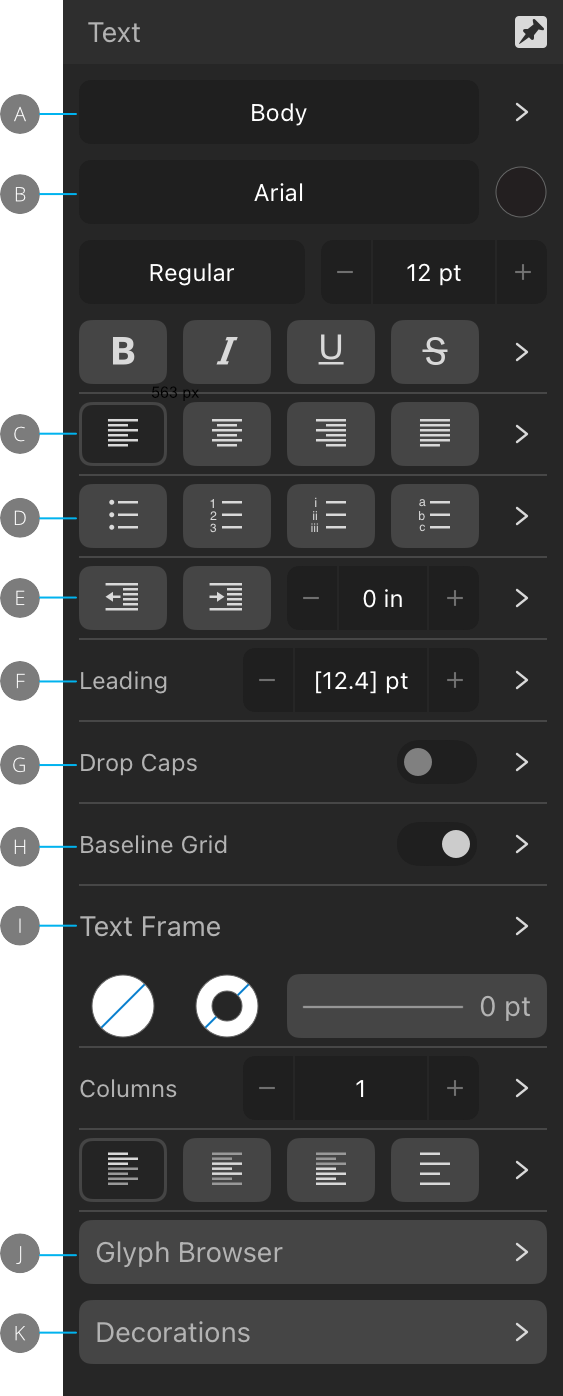
 Tap the pin icon in the top right of the panel to hide the panel automatically when you are no longer focusing on it.
 Each section of the panel's top level shows its most commonly used options. Tap the arrow at the right of a section to expand it, which reveals additional options.
 When viewing a section or subsection, tap the arrow at the top left of the panel to return to the top level/parent section, respectively.
 Text Styles
 Update Paragraph Style—redefines the current paragraph style to conform with the local formatting of the selected text. (Shown only when local formatting has been applied in addition to the selected text style.)
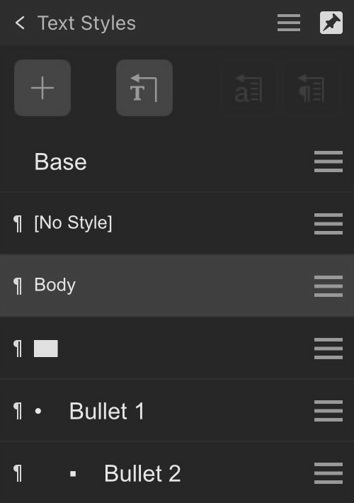
 Add Text Style—displays a submenu for creating a new
  Reset/Reapply Styles—displays a submenu to:
 Update Character Style—redefines the current character style to conform with the local formatting of the selected text.
 Type—specifies whether the text style is a
  Options menu—shown at the right end of a text style's entry and provides access to a pop-up menu with creation and editing options.
 Character
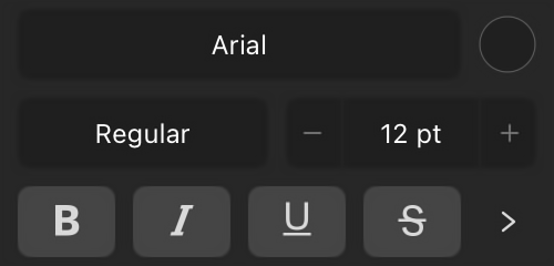
 Standard Ligatures—applies any available typeface ligatures to the selected text.
 Contextual Alternatives—applies any alternative typeface designs available for glyphs depending on their relative position within a word or with respect to neighboring glyphs.
 Ordinals—automatically applies a superscript to letters which are part of an ordinal number.
 Fractions—dynamically converts fractions into a single glyph.
 Superscript—converts text characters to superscript, i.e. characters are set higher than neighboring characters and font size is decreased.
 Subscript—converts text characters to subscript, i.e. characters are set lower than neighboring characters and font size is decreased.
 All Caps—displays all selected text as upper case (or small caps, if Small Caps option selected).
 Small Caps—displays lower case letters as miniature upper case.
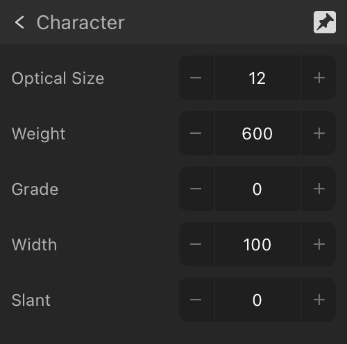
 Justification and Flow
 Left Align—sets the paragraph alignment to adhere to the left edge of the text container.
 Center Align—sets the paragraph alignment to be equidistant between the left and right edges of the text container.
 Right Align—sets the paragraph alignment to adhere to the right edge of the text container.
 Justified Left—sets the paragraph alignment to both the left and right margins. The last line of a paragraph is left aligned.
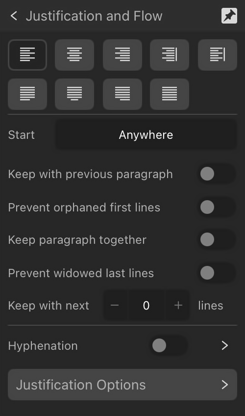
 Align Towards Spine—aligns the paragraph dynamically towards the left or right of the spine depending on relative positioning of the text frame in relation to the spine (no justification used).
 Align Away From Spine—aligns the paragraph dynamically away from the left or right of the spine depending on relative positioning of the text frame in relation to the spine (no justification used).
 Justified Center—as with Justified Left, however, the last line of a paragraph is center aligned.
 Justified Right—as with Justified Left, however, the last line of a paragraph is right aligned.
 Justified All—as with Justified Left, however, the last line of a paragraph is justified regardless of length (sometimes known as Force-Justified).
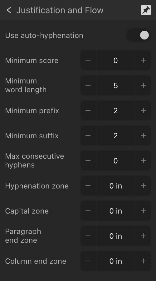
 Bullets and Numbering
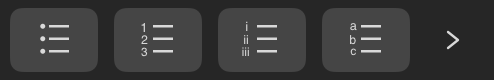
 Bullet List—inserts a bulleted list.
 —inserts a numbered list based on decimal numbers.
 Roman List—inserts a numbered list based on small Roman numerals.
 Latin List—inserts a numbered list based on Latin alphabetic characters.
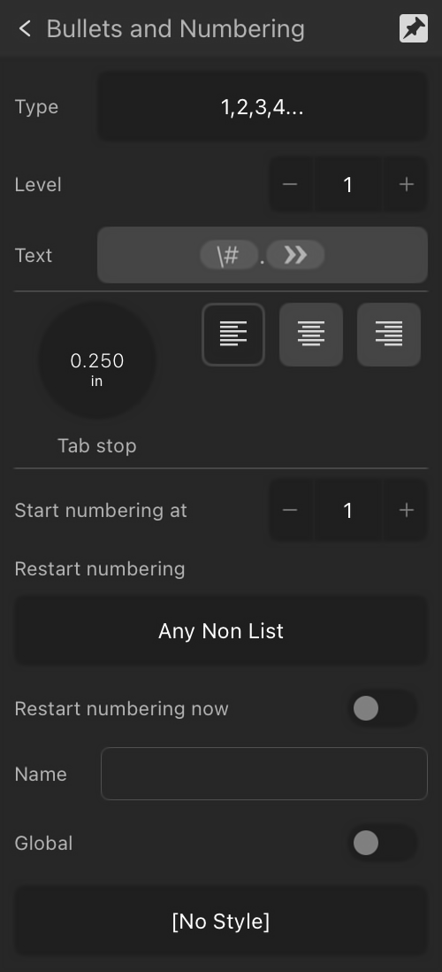
 Indents and Tab Stops
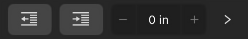
 Decrease Indent—decreases the amount of indent at the start of text.
 Increase Indent—increases the amount of indent at the start of text.
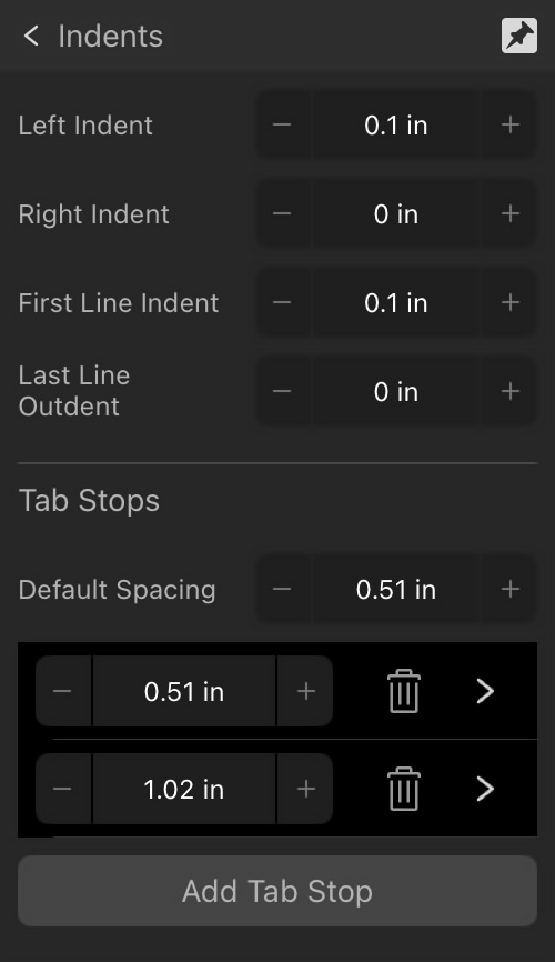
 Delete selected tab stop—shown on a tab stop entry, this removes a chosen tab stop.
 Spacing
 Drop Caps and Initial Words
 Baseline Grid
 Text Frame
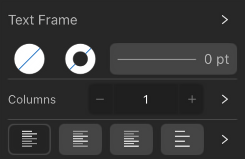
 Top Align—sets the frame text alignment to adhere to the top margin.
 Center Align—sets the frame text alignment to be equidistant from the top and bottom margins.
 Bottom Align—sets the frame text alignment to adhere to the bottom margin.
 Justify—sets the frame text alignment to both the top and bottom margins.
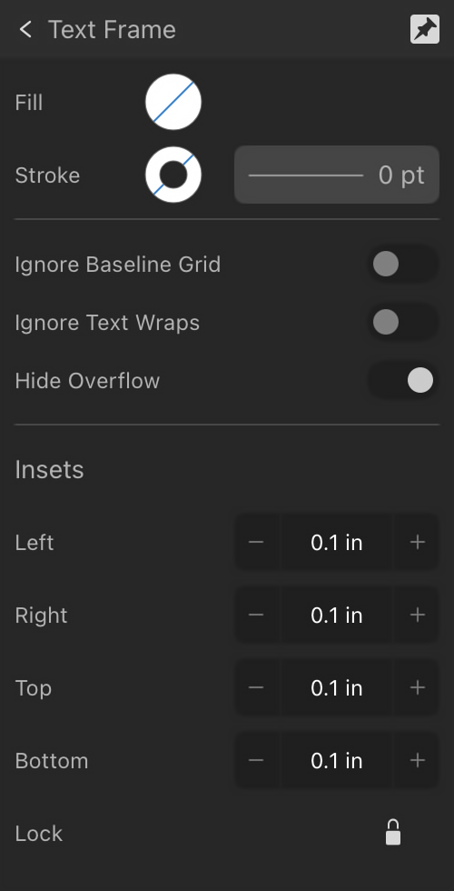
 Glyph Browser
 Lock Font and Traits—when unlocked, the font shown in the panel changes with the selected text's font, making it easier to find glyphs from the currently selected font. When locked, the font shown in the panel doesn’t change with text selection. This makes it easier to repeatedly use glyphs from a particular font.
 Decorations
 Position—specify where you would like the decoration to appear in relation to the selected paragraph. Select from Left, Top, Right, Bottom or Fill (additional options will become available in the panel when one of these is selected).