The Color panel is used to apply color to the stroke and fill of shapes, lines and text.
About the Color panel
The panel can operate in several color modes—RGB, RGB Hex, HSL, CMYK, LAB and Grayscale—and has various ways of presenting color options—as sliders or as a color wheel (HSL only).
Color panel (RGB Sliders): (A) Stroke/Fill color selectors, (B) Color Picker and picked color swatch, (C) Color model selection, (D) RGB sliders, (E) Opacity control associated with color, (F) Noise control for a graininess effect, (G) Easy access commonly used 'Quick' colors (None, K-only Black, Mid-gray, Black and White swatches) and recently used colors and (H) Swatches section for storing colors and palette control.
The active color selector is shown at the front of the two color selectors. Choosing a new color will apply it to the active color selector.
Tap the pin icon in the top right of the panel to hide the panel automatically when you are no longer focusing on it.
Using the Color panel
With the Color panel, colors can be set for use by a tool in just a few taps. Opacity and noise are further attributes which can be applied with a color.
Color display options and color models
When choosing colors in the Color panel, you can choose different ways to present color options (e.g., by wheel or slider) and different color models. For example, if you want to design a hi-res CMYK print document, you could select color using CMYK Sliders to match with a CMYK color profile chosen at document setup. This doesn't change the working color profile of the document, but changes the input values for the colors only.
The following color options are available using the navigation buttons.
Sliders (RGB, RGB Hex, HSL, CMYK, LAB, Gray)
Tap the left/right navigation buttons under the color selectors to jump between color options and models.
Drag sliders or type directly into the value boxes to set the color values.
Color Wheel (HSL)
Drag on the outer ring to set the hue.
Drag in the color box to set saturation and lightness.
To set the color of a selector:
Tap the selector you want to apply the color to. It will show at the front of the two color selectors.
Do one of the following:
Select a color from the slider or color wheel.
Tap the picked color swatch (if you've previously color picked).
Select one of the five most Recent Colors.
Using swatches
The Swatches section stores your recently used colors and lets you access a range of predefined palettes, each containing solid or gradient fill swatches. These can be selected for use with various tools and for applying directly to objects. You can also create and store your own swatches in custom color palettes either for the document or the app.
Swatches are organized into color palettes by category.
Swatches section (Color panel): (A) Fill/Stroke color selectors, (B) Color Picker and picked color swatch, (C) Panel Preferences, (D) Palette selection, (E) Swatch or list view, (F) Palette swatches, (G) Easy access commonly used ‘Quick’ colors (None, K-only Black, Mid-gray, Black and White swatches) and (H) Recently used colors.
Options
The following options are available from the Panel Preferences menu.
Add Current Fill to Palette—with a palette selected, adds the currently selected object's fill (or color chosen in the panel) to the palette in the Swatches section.
Add Current Fill as Global—like Add Current Fill to Palette but the currently selected object's fill (or color chosen in the panel) is added as a global color so it can be shared across objects. You must have a custom Document palette created and selected to use this option.
Add Global Color—creates a global color from scratch that can be updated automatically across multiple objects; they can be made as spot colors or to overprint, or both. You must have a custom Document palette created and selected to use this option.
Add Application Palette—creates an application palette in the Swatches section.
Add Document Palette—creates a document palette in the Swatches section.
Rename Palette—allows you to rename the currently selected Document palette.
Duplicate Palette—makes an unlinked copy of the current Application palette that isn't shared with other local apps.
Link Palette—allows you to link an Application palette for use in all Affinity apps on your device.
Delete Palette—removes the currently selected Document palette.
Import Palette—imports an .afpalette or .ase file as a new application or document palette.
Export Palette—exports the currently selected application or document palette as an .afpalette file.
Palettes
The following types of palette exist within your Affinity app:
Document—these palettes are created by the user and saved within the current document; they store your custom colors.
Application—these palettes are saved with your Affinity app, and are available to any Affinity Publisher document.
PANTONE®—these palettes are based on PANTONE® Colors. These palettes are pre-supplied with the app, and are available to any Affinity document.
You can permanently store custom colors and gradients that you use most often in any of the palettes or you can create custom Document palettes to host them. We recommend the latter.
Saving chosen colors for later use
Once your color has been chosen and applied to a tool or content, there are several ways to preserve this color for later use.
Creating and saving to custom color palettes
To create a new palette:
With the Swatches section open, tap Panel Preferences and choose an 'Add Palette' option.
To save a color or gradient to a palette:
Choose the color from the sliders or equivalent.
Open the Swatches section, and select a palette from the category list.
From the Panel Preferences, select Add Current Fill to Palette.
To rename or delete a saved swatch:
Long press the swatch you want to rename or delete and choose Rename or Delete from the pop-up menu.
Importing and exporting custom color palettes
Custom color palettes can be exported to and imported from external files (add-ons) via the Swatches section's Panel Preferences menu. For more information on add-ons, see the About add-ons topic.
 Color panel
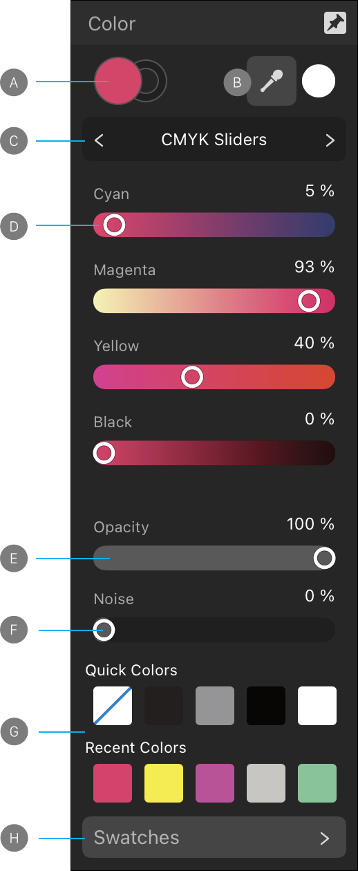
 Tap the pin icon in the top right of the panel to hide the panel automatically when you are no longer focusing on it.
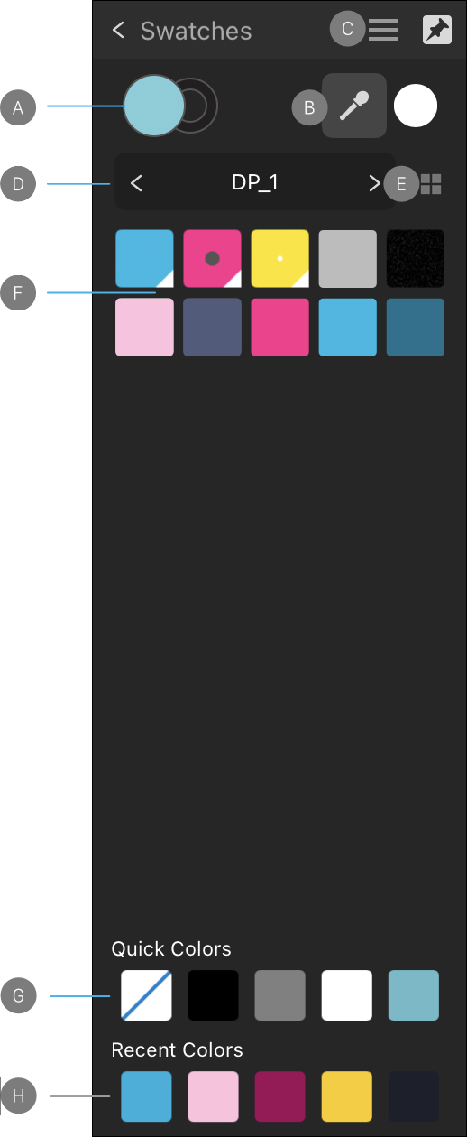
 The following options are available from the Panel Preferences menu.